
Dogecoin is a cryptocurrency, like Ethereum or Bitcoin — despite the fact that it’s totally different than both of these famous coins. Dogecoin was initially made to some extent as a joke for crypto devotees and took its name from a previously well-known meme.
In this article, we will be implementing a machine learning model which can predict the pattern or forecast the price of the coin in the upcoming days. Let us now move toward the implementation of price prediction.
Importing Libraries and Dataset
Python libraries make it easy for us to handle the data and perform typical and complex tasks with a single line of code.
- Pandas – This library helps to load the data frame in a 2D array format and has multiple functions to perform analysis tasks in one go.
- Numpy – Numpy arrays are very fast and can perform large computations in a very short time.
- Matplotlib/Seaborn – This library is used to draw visualizations.
import pandas as pd
import numpy as np
import matplotlib.pyplot as plt
import seaborn as sns
from sklearn.ensemble import RandomForestRegressor
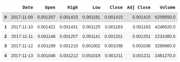
Now let us load the dataset in the panda’s data frame. One can download the CSV file from here.
data = pd.read_csv("DOGE-USD.csv")
data.head()
Output:
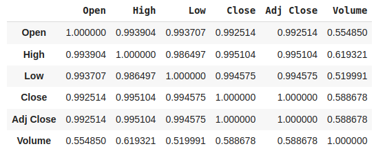
Now, let’s check the correlation
data.corr(numeric_only=True)

# This code is modified by Susobhan Akhuli
Output:
Converting the string date & time in proper date & time format with the help of pandas. After that check is there any null value is present or not.
data['Date'] = pd.to_datetime(data['Date'],
                              infer_datetime_format=True)
data.set_index('Date', inplace=True)

data.isnull().any()
Output:
Open         True
High         True
Low          True
Close        True
Adj Close    True
Volume       True
dtype: bool
Now, let’s check for the presence of null values in the dataset.
data.isnull().sum()
Output:
Open         1
High         1
Low          1
Close        1
Adj Close    1
Volume       1
dtype: int64
Dropping those missing values so that we do not have any errors while analyzing.
data = data.dropna()
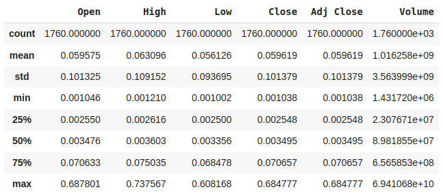
Now, check the statistical analysis of the data using describe() method.
data.describe()
Output:
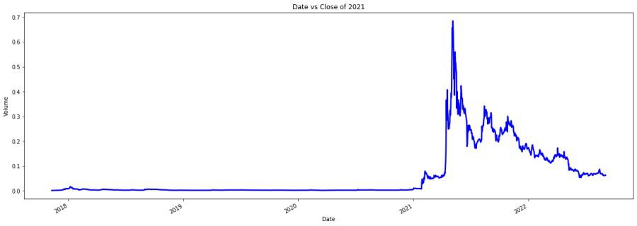
Now, firstly we will analyze the closing price as we need it to perform the prediction.
plt.figure(figsize=(20, 7))
x = data.groupby('Date')['Close'].mean()
x.plot(linewidth=2.5, color='b')
plt.xlabel('Date')
plt.ylabel('Volume')
plt.title("Date vs Close of 2021")
Output:
The column ‘Close’ is our predicted feature. We are taking different factors from the predefined factors for our own calculation and naming them suitably. Also, we are checking each factor while correlating with the ‘Close’ column while sorting it in descending order.
data["gap"] = (data["High"] - data["Low"]) * data["Volume"]
data["y"] = data["High"] / data["Volume"]
data["z"] = data["Low"] / data["Volume"]
data["a"] = data["High"] / data["Low"]
data["b"] = (data["High"] / data["Low"]) * data["Volume"]
abs(data.corr()["Close"].sort_values(ascending=False))
Output:
Close        1.000000
Adj Close    1.000000
High         0.995104
Low          0.994575
Open         0.992514
Volume       0.588678
b            0.456479
gap          0.383333
a            0.172057
z            0.063251
y            0.063868
Name: Close, dtype: float64
By, observing the correlating factors, we can choose a few of them. We are excluding High, Low, and Open as they are highly correlated from the beginning.
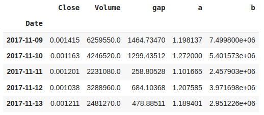
data = data[["Close", "Volume", "gap", "a", "b"]]
data.head()
Output:
Introducing the ARIMA model for Time Series Analysis. ARIMA stands for autoregressive integrated moving average model and is specified by three order parameters: (p, d, q) where AR stands for Autoregression i.e. p, I stands for Integration i.e. d, MA stands for Moving Average i.e. q. Whereas, SARIMAX is Seasonal ARIMA with exogenous variables.
df2 = data.tail(30)
train = df2[:11]
test = df2[-19:]

print(train.shape, test.shape)
Output:
(11, 5) (19, 5)
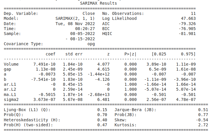
The shape of the train is (11, 5), and the test is (19, 5). Let’s implement the SARIMAX model and see the results.
Model Development
from statsmodels.tsa.statespace.sarimax import SARIMAX
model = SARIMAX(endog=train["Close"], exog=train.drop(
    "Close", axis=1), order=(2, 1, 1))
results = model.fit()
print(results.summary())
Output:
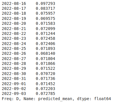
Now, observe the prediction in time series.
start = 11
end = 29
predictions = results.predict(
    start=start,
    end=end,
    exog=test.drop("Close", axis=1))
predictions
Output:
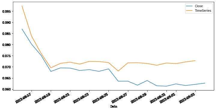
Finally, plot the prediction to get a visualization.
test["Close"].plot(legend=True, figsize=(12, 6))
predictions.plot(label='TimeSeries', legend=True)
Output:
Get the complete notebook and dataset link here:
Notebook link : click here.
Dataset Link: click here